The last thing any web creator wants is a frustrated user leaving their website due to a cluttered layout that is difficult to navigate through. It is important to believe that most minor details in website design can significantly impact the bounce rates, conversion, and more. So, in this blog, we bring you the ultimate best practices to optimize website layouts using Elementor.
According to a web credibility research carried out by Stanford, as many as 75% of website users judge a site’s credibility depending on the visual designs. While another research shows that 38% of the users abandon a website if they find the layout unattractive.
Nobody likes surfing through slow websites with cluttered layouts, clashing color schemes, or a difficult-to-read and navigate design. Whenever a client comes across such websites, the most common response is to click away and find another website to visit in its place.
It is, therefore, essential to create web posts and pages for your site using optimal techniques. A stunning, optimized website layout created following the best practices can increase your site traffic, increase conversion rate, grow engagement and increase your site’s ranking. Stay tuned in to explain how you can achieve all these and effortlessly optimize website layouts using Elementor.
Optimize Website Layouts With Elementor To Enhance User Experience
Elementor is one of the most popular free WordPress website builders out there, and using this flexible page builder to create a web page is a breeze. It’s a fully customizable drag-and-drop page builder that allows you to create a website without coding in seconds.
Note: Use lightweight, fast loading and responsive themes such as ‘Hello’ or Flexia to help you optimize website layout with endless customizability.
You can easily create high-performing WordPress website layouts with Elementor following the best practices to optimize website layouts.
Improve The Header And Footer Sections Of A Web Page
Headers and Footers bind your content together and help to create a professional-looking website in no time. These are the two sections where you include the website logos, and links to the most notable web contents or pages and therefore are essential in presenting your brand to the world.
However, these sections may also be gravely responsible for reducing your site’s performance if they include too many columns, widgets, and logos.
Optimize The Header Section:
We recommend you use a minimal number of columns on your header section – a maximum of two for optimizing the layout.
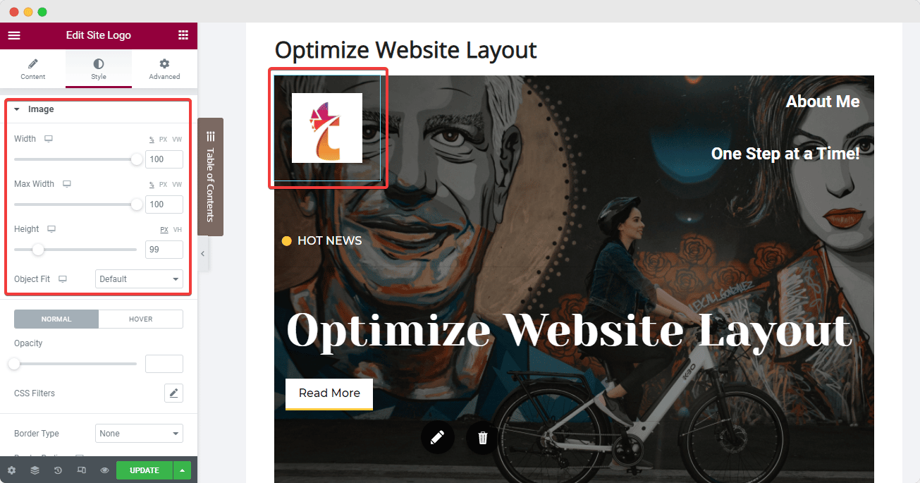
Elementor brings you an exclusive site logo widget to create and style your website logos and personalize them according to your business aesthetics. Ensure to set the right image dimensions from Elementor editor’s ‘Style Tab’ when uploading the logo which will help to avoid a layout shift when the web page loads. Also, do not forget to add a relevant image title to and Alt tags to improve SEO rankings.
Next, we have the Nav Menu widget from Elementor which we can set onto the 2nd column. Here, you can add all the significant pages and posts by configuring the ‘Menu Screen’ on your website dashboard, and then modify the layout using Elementor’s ‘Content’ and ‘Style’ tabs. One best practice here is to set the pointer to ‘none’ to avoid a cluttered look.
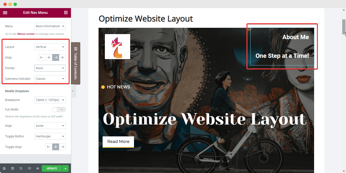
You can add any other required widgets to your header (example: Icon List widget) right underneath the Nav Menu within the same column.
Once you are satisfied with the header columns and widgets, set the elements in line with each other and also set the column’s positioning in line with the widgets. Follow the steps below to achieve this optimized layout:
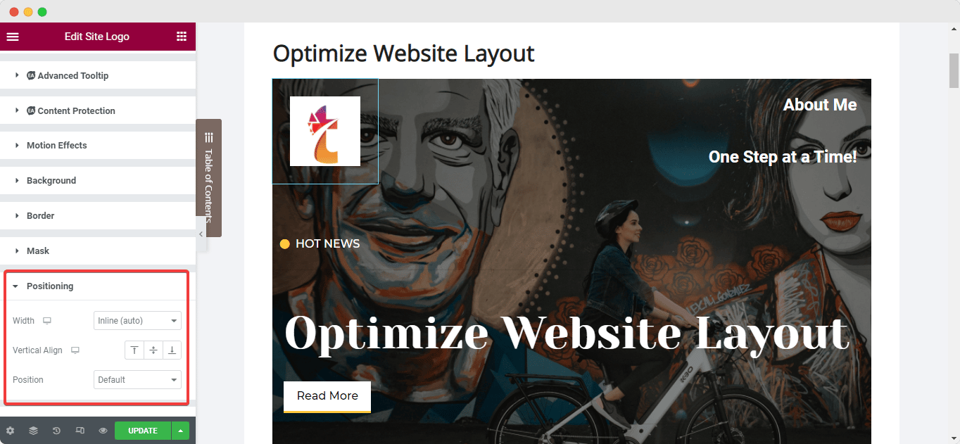
Select your widget and navigate to the ‘Advanced’ tab from the Elementor side panel and set the width of the widget to ‘Inline’ under the ‘Positioning’ option. This will place the widgets in line with each other instantly.
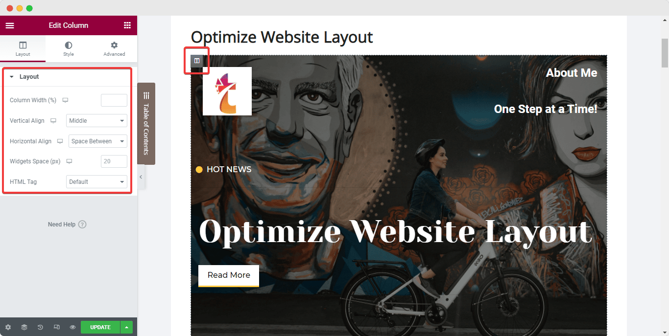
Next, to set the column inline with the widgets, select the column and navigate to its ‘Layout’ tab. Then, under ‘Vertical Align’, choose ‘Bottom’ while selecting the ‘Space Between’ option for ‘Horizontal Align’.
Optimize The Footer Section:
Similarly, website creators often make a common mistake of using multiple widgets in the Footer section to add descriptions, links, and copyright symbols. The best practice to optimize your website layout, in this case, will be to use widgets that offer multiple functionalities and reduce excessive use of sections in the Footer.
You can merge certain widgets into one section to keep the Footer clean and more attractive. You can now also create a Footer that will update itself continuously with the Dynamic tags from Elementor. Read this dedicated document to learn more.
Catch Eyes Instantly With An Attractive Hero Banner
Next up, we have the Hero Section or banner of your website page. The best practice to optimize this section layout is to use a banner with bold text that is clearly visible to the website users.
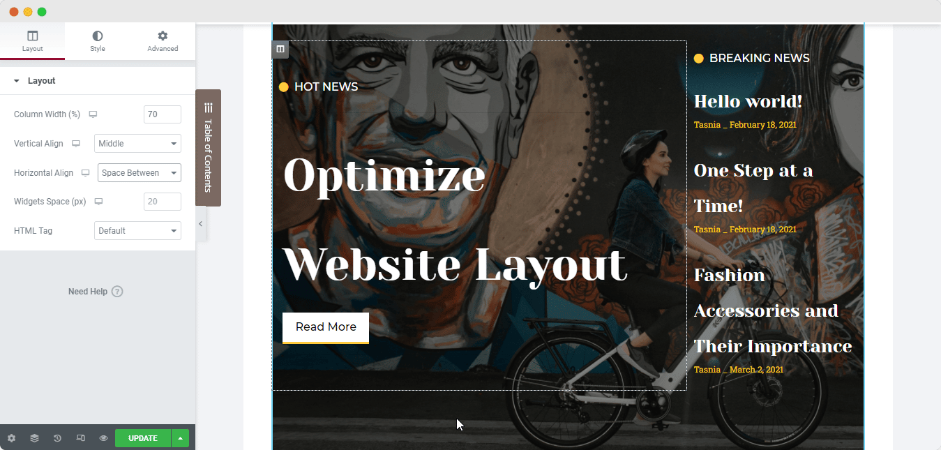
To make the texts clearly visible over any background or image in your Hero Banner, position text using the column alignment options. Again, select the column as you did for the header section and set the ‘Vertical Alignment’ to ‘Middle’ and then configure the paddings as needed to ensure the layout is optimized to the fullest.


